Link Placement Guide
Drive Customers to Your Instant Gift Certificate Page and Accelerate Your Profits
Picture, for a moment, your businesses' website and the people who see it. They start at your home page, but where do you want them to end up?
Your job is to take them on a journey that starts with the ease they feel when navigating your content, and finishes with them becoming a client. You want them to end their trip by booking a service or buying an Instant Gift Certificate. Does your current website accomplish this goal? If not, there are trouble spots that we've outlined below - and their solutions - to improve visitors' experience and make them a happy customer.
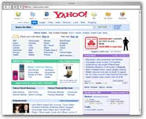
- Road debris. Too much happening at once on the page can make finding the thing your customer really wants difficult. Compare the front pages of Yahoo! and Google, then consider how quickly your eye can locate the field to type in your web search:
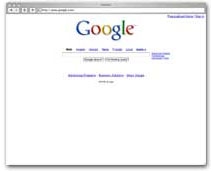
Emulate Google's strategy by placing a clean and elegant link to your new Instant Gift Certificate page right in your main navigation bar. - Detours. Once a customer has decided to click on your Instant Gift Certificate link, don't make them regret it by taking them first to an intermediary page describing your products or your shopping cart; just send them directly to the buying page and you're far less likely to lose their interest.
- Opportunities to Rubber-Neck. Much like the lights and sirens of emergency vehicles command attention on the road, flashing graphics and loud background clatter can be doubly disastrous on your site: users are known to ignore graphics, but before they can ignore that talking mascot their eye has been inevitably drawn towards it, away from your more friendly text links. Don't advertise a featured event in one corner and have your Instant Gift Certificate link blending into the decor on the opposite side of the screen. Simple and direct - but targeted - is the answer.
- Inconsistent Road Signs. First your menu bar is on the top of the page, but later it's on the side, and then on top again... Consistency makes for a calmer and more focused client and one likely to navigate directly to the products they want from you. When your link is in the same place on each page, the "where to click" question never needs to get asked.
- Not Enough Destination Signage.
 Talk about your new functionality - be proud and excited!
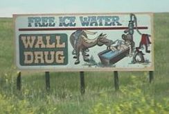
Have you ever driven on the interstates within 500 miles of Wall Drug in South Dakota? For literally hours the driver is reminded that they are getting ever closer to that magical treasure trove of road trip souveniers. If you miss Wall Drug, it is because you've deliberately avoided it, not because you didn't know which exit to take. It should be exactly the same with your customers and your Instant Gift Certificates. Make mention of your new page in the text of your main content, and again on other pages within your website, not just on the menu bars.